QR Code Design Psychology: Color Placement and CTA Optimization
The strategic role of QR codes in business
How perception shapes scanning behavior
QR codes in business have matured from novelty to necessity, connecting physical moments to digital experiences in seconds. Yet performance still hinges on design psychology: how color placement guides the eye, how contrast supports machine vision, and how a clear call to action (CTA) reduces hesitation. Treating QR codes as micro-interfaces—rather than decorative add-ons—turns them into dependable digital transformation tools that support modern marketing strategies, from packaging to events to out-of-home (OOH) media.
Color placement that maximizes scannability
Contrast, luminance, and non-inverted patterns
For reliable scanning, the camera must clearly separate dark modules from a lighter background. That means prioritizing luminance contrast over hue and avoiding light-on-dark inversions that degrade error correction. Usability research reinforces these fundamentals; see Nielsen Norman Group’s QR code usability guidelines. And on the standards side, the ANSI overview of ISO/IEC 18004:2024 explains the symbology rules that underpin consistent decoding, reminding teams to keep the code’s visual structure intact.
Quiet zones, backgrounds, and brand‑safe styling
Color can support branding, but only when it respects the format. Keep the three finder patterns and timing patterns dark and fully intact, maintain a clean quiet zone around the code, and avoid busy textures that create false edges. If you introduce gradients or brand hues, confine them to interior modules with enough luminance difference from the background. Place color strategically around the code—frames, pointers, or short copy—to draw attention without interfering with the pixel grid that scanners rely on.
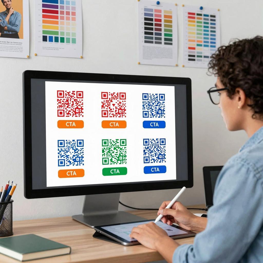
CTA optimization around the code
Copy, color, and proximity that drive action
The best-performing QR activations pair a scannable mark with a low-friction CTA. Use action-oriented, value-forward copy (e.g., “Scan to get priority access” or “Scan to claim your warranty”) and place it within a finger’s width of the code so intent and action remain coupled. Choose a CTA color that stands out from the background but doesn’t compromise the code’s dark-on-light contrast. Microcopy that sets expectations—time to complete, benefit, and trust markers—reduces cognitive load and boosts conversion.
Page and packaging placement that fits real‑world use
Placement should reflect how and where people will scan. On packaging, favor flat, non-glossy panels away from seams or curves; on signage, mount at comfortable eye level with sufficient size for typical viewing distance (a common rule-of-thumb is that larger distances require proportionally larger codes). Ensure even lighting, avoid reflective finishes, and provide a visual affordance (arrow or label) so the code is discoverable at a glance.
Test, measure, and include everyone
Experiments and accessibility checks for continuous gains
Iterate with intent. Build an A/B matrix around three levers—CTA language, color treatment, and placement—then track scan rate, load success, and downstream conversion. Use short, branded URLs on the landing page, and instrument events so you can attribute scans to specific creatives or locations. This turns QR codes into measurable digital transformation tools and aligns them with data-driven, modern marketing strategies.
Color‑blind safety and redundant cues
About 1 in 12 men have some form of color vision deficiency, so rely on luminance contrast and provide redundant cues (icons, outlines, labels). When choosing inks for print, prefer dark foregrounds on light backgrounds and avoid low-contrast combinations that flatten under poor lighting; guidance on acceptable barcode color combinations illustrates why certain ink pairs fail machine vision even when they look “on-brand.” Always add a short fallback URL near the code for users who cannot or prefer not to scan.
Conclusion
Design for brains first, cameras second
QR success is a balance: cameras need clean contrast and structure; people need clarity, motivation, and trust. Lead with dark-on-light color placement, preserve the code’s anatomy, and pair it with a tight, benefit-driven CTA positioned nearby. Then validate with disciplined testing. Done right, QR codes in business become reliable bridges in your omnichannel mix—small but mighty digital touchpoints that advance modern marketing strategies and accelerate digital transformation, one scan at a time.